The Language of Colour
27/02/2015
Author: Victoria Jones
Colour is a very emotive design tool, and our reactions to many colours are deeply rooted in our psyche and culture so it’s important to choose your brand colours carefully. There is a reason that bright, warning red is used for road signs and hospital wards are painted a soothing pastel green or blue!
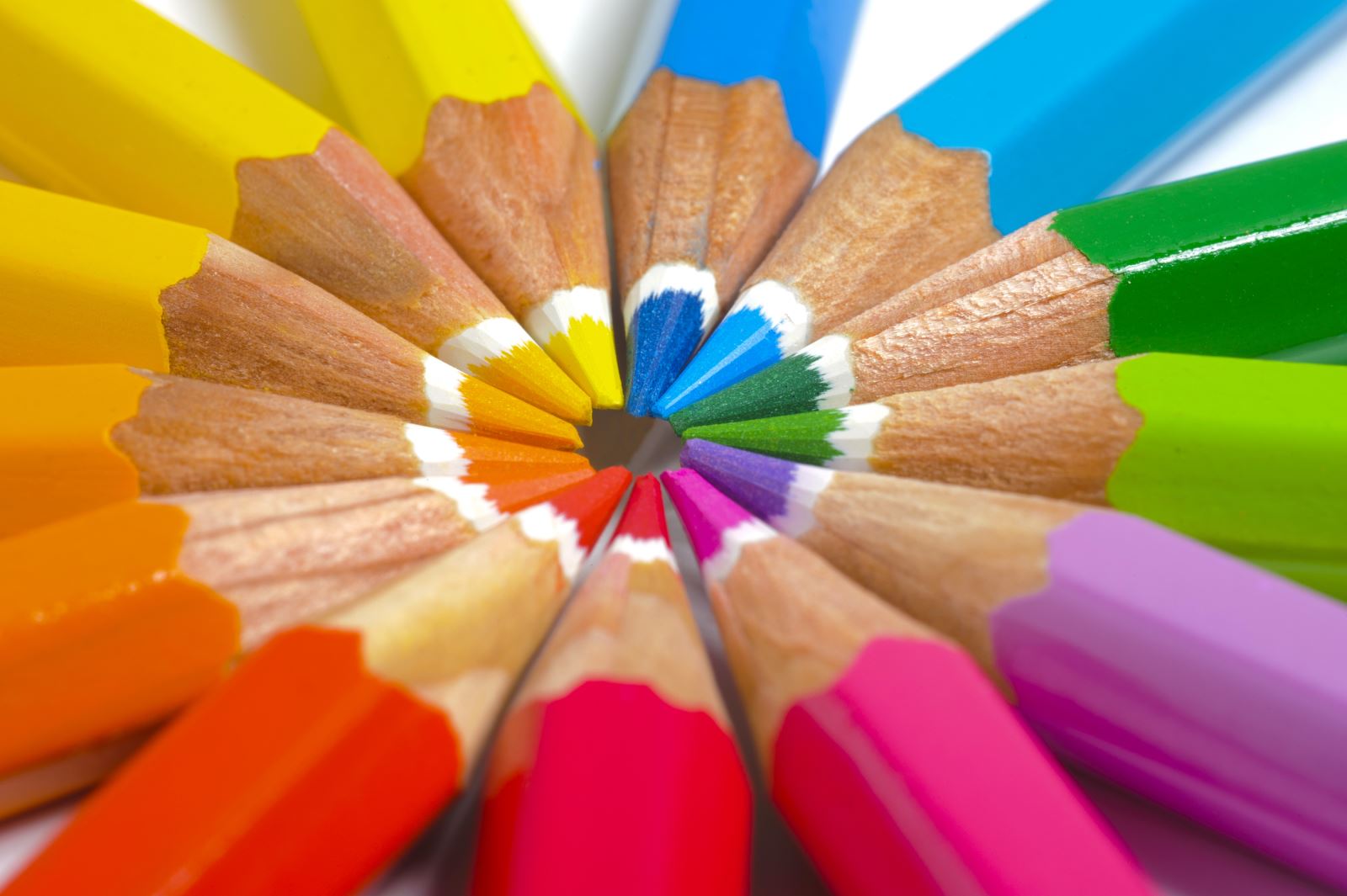
As well as considering what you want your brand colour to say about you, you also have to consider how the supporting colours in your scheme work together – this is where you need to consider a colour wheel. A general rule of thumb is that colours which are opposite each other on the wheel complement each other – but it is always worth having play around with an interactive colour wheel tool like www.paletton.com to see how you can bring different colours into your scheme.